A Small iPhone
The Android fanboys have been toting their phablets for years now, while Apple have stubbornly stayed with their 5 cm wide screen at 320 points, claiming it is the perfect fit. I agreed, and honestly thought the status quo would continue. That Apple left the established form factor for two larger devices made a lot of people –like me– surprised and disappointed. I feel the size-race is little more than a gimmick for handset makers who can’t compete on hardware and software quality.
Alas, bigger it is.
Still, I don’t want a larger device in my pocket. I already have to allocate a whole pocket for the phone. What if Apple would think diffrent and release a small phone instead? I’d totally go for a small iPhone.
The iPhone nano
That is by no means a new idea. There are a lot of mockups small iPhones on the web, but they mostly miss the point. Differing screen sizes provides very diffrent experiences. As a UI designer, I wanted to see how the existing iOS could be adapted to a much smaller screen.
The Concept
I imagine the screen would be 75 % as wide and tall as the iPhone 5. Any smaller, and the iOS interface paradigm wouldn’t work. Just look at the Apple watch. A screen that small shrinks the device enough to let you hold it securely with your index and middle fingers, with the thumb reaching the entire screen. I tried this out with a paper dummy, and it feels really comfortable.
The screen area would shrink to just 56 % (.752 ≈ .56), so features will have to be sacrificed to retain the same clarity. I put together a few mockups of popular apps to show what it could look like.
Mockups
The shaded part behind each mockup shows the original app at the relative size for comparison.
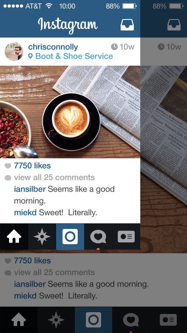
Instagram worked really well. The bottom tabbar lost some whitespace, but doesn’t feel too crammed. I had to add a line break to fit the same amount of text, and the photo is shrunk and cropped pretty hard. You couldn’t really see much of it anyway on the small screen, so no big loss. (Yes, I know Instagram is all about photos. I imagine you would have to check out the more interesting ones on a larger device.)
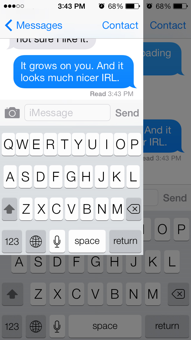
The keyboard is difficult to shrink. It is bad enough in portrait mode in full size. I had to remove some of the button width, and almost all gutter on the top row. Still, it seems usable.
More importantly, you now have to chose if you want to type or read. There just isn’t enough space for both.
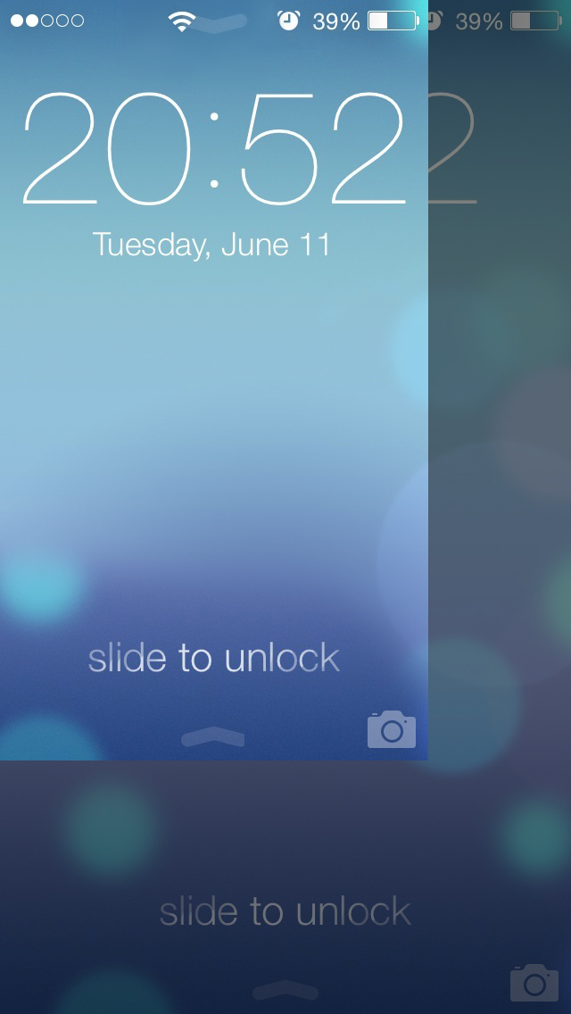
The lock screen wouldn’t change much.
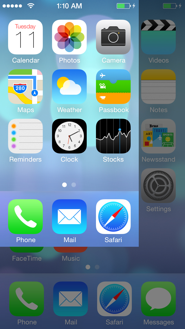
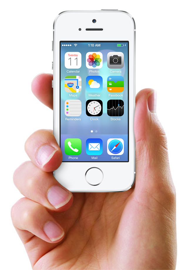
Even the home screen looks pretty much the same, just with fewer icons. It actually looks a bit cleaner with less stuff in it.
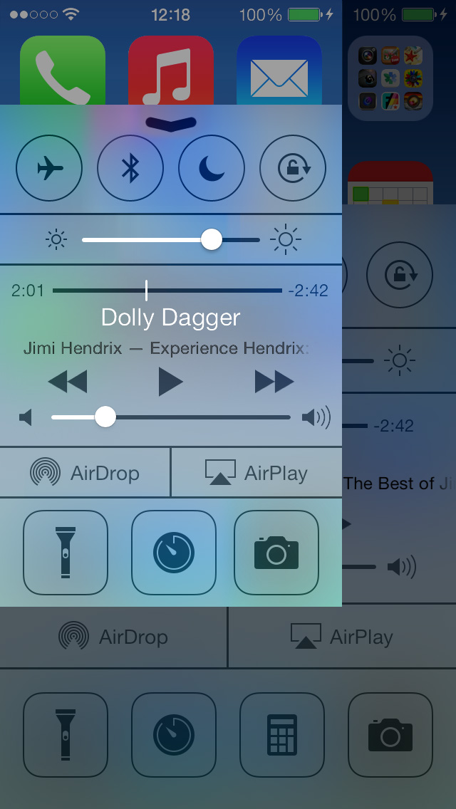
The control center whitespace had to be trimmed a lot, and one of the icons in both the upper and lower rows just had to go. It does feel cluttered, but not much worse than the original.
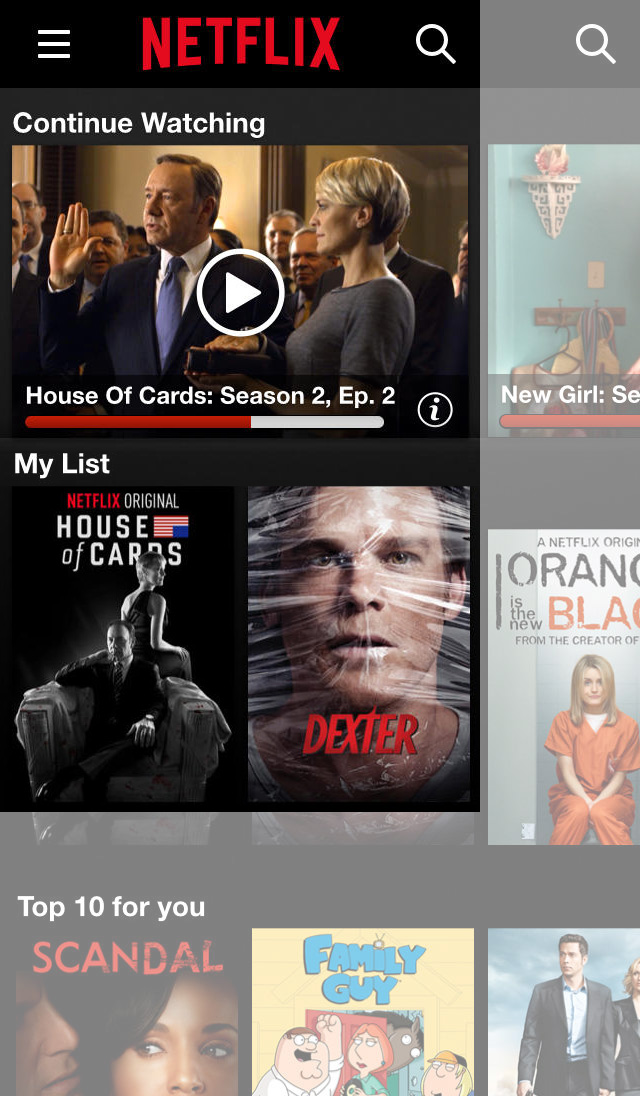
Netflix has thumbnails that can’t really be shrunk down much more without losing clarity. Which is too bad, since the original fits just about a fractional amount of thumbnails on the screen, which very nicely invites to scrolling through the lists. This interface could use a complete redesign to work as well as the larger version.
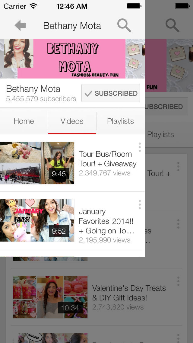
Youtube is very straight forward and simple to shrink. The only problem is the list of videos, that has a box-within-a-box kind of design. It wastes way too much whitespace, so I choose to let the list cells extend all the way to the screen edge, and let the thumbnails touch the edge. I’m sure it could be made to look better, though.
And that was all. If you have any thoughts on this, you should comment.