At The Receiving End Of Bad UI
I am a developer in my own startup. We pride ourselves on our strong focus on UX and good UI design. We consider this such a central concept that we all (all two of us) take part in the UX design process. This goes deeper than the professional level – we like to talk about all aspects of UX, as well as design for the sake of it. We send each other links with examples of great UI as well as the less great.
I upgraded to the iPhone 4S shortly after it was released. I had some problems with the carrier in the beginning – calls would not connect properly at the first attempt – but the problems disappeared.
However, I noticed that SMS messages would arrive twice, but still show up only once in the list. This puzzled me, and when the issue persisted, I decided to contact the carrier customer support. I found the contact page on their website and filled out the form.
A few days later, I received a response.
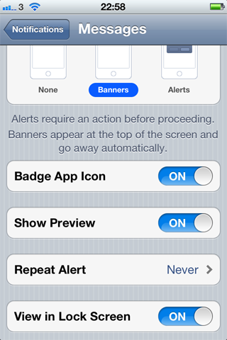
You can change this setting under Settings - Notifications - Messages. On that page you will find “Repeat Alert”, where you can set it never to repeat notifications for messages.

Oh.
Once I saw the settings screen, a vague memory popped up. I had visited this setting before, saw “Once”, had a brain fart and selected it, because I wanted to see the alert exactly once.
The problem is the wording of the setting “Repeat Alert”. That makes the repeats of the first alert a separate concept, from the original alert. The natural way to think of it would be in terms of the absolute number of times the alert shows up.
I’m suspecting that they just couldn’t come up with an elegant wording for “Number of times to show the alert”, and choose a more strained concept with a better name.
What surprised me was the level of embarrassment I immediately felt. We all know how non-computer-people are often reluctant to even try to solve computer related problems, but now I can imagine how they feel.
Of course, I have no reason to feel embarrassment. If the UI is not clear enough to be instantly understandable, the blame is always on the designer. And if I know Apple, that is the level of polish they strive for.